


Published 5 Jul 2024
Best Modern Web Design Trends: A Comprehensive Guide
Explore the modern web design trends shaping user experience today, from dark mode to AI chatbots. Talk to Webtricker about your next site today.
Best Modern Web Design Trends: A Comprehensive Guide
Web design keeps shifting as user expectations evolve, and the modern web design trends that matter right now are less about novelty and more about real usability gains. This guide breaks down what's actually working, from dark mode to AI chatbots, and how to apply it without overcomplicating a site.
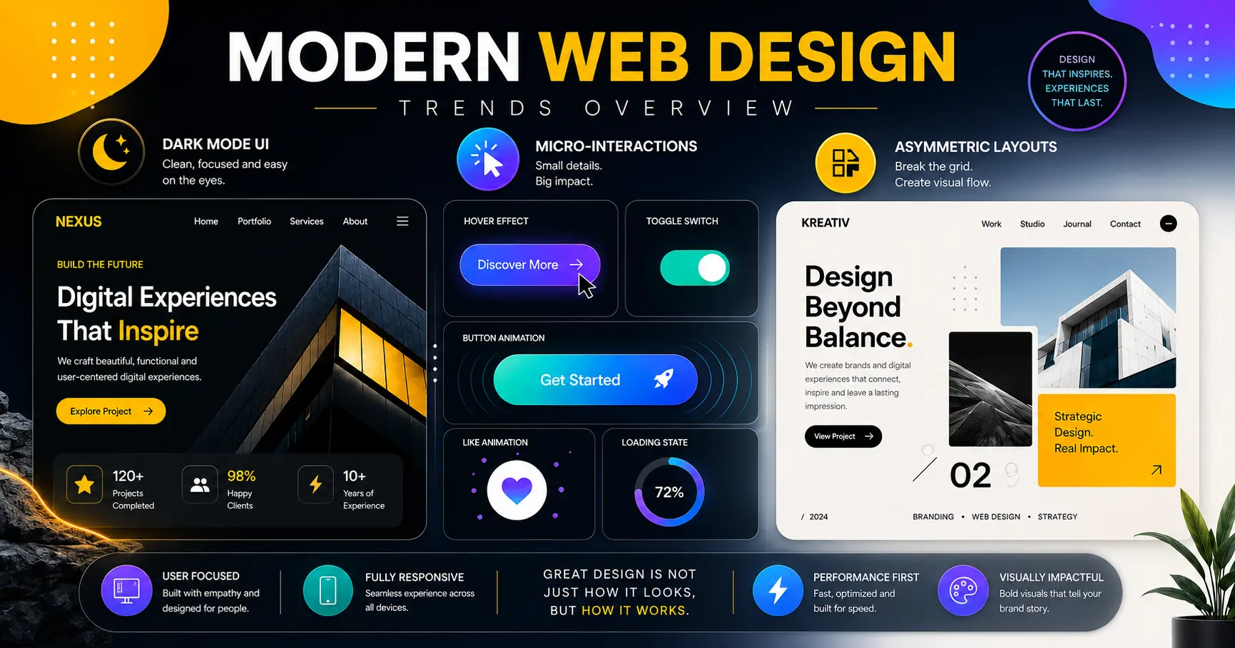
Quick Answer: The modern web design trends shaping websites today include dark mode, 3D elements, neumorphism, micro-interactions, asymmetric layouts, voice user interface design, and AI-powered chatbots. The strongest sites combine a few of these thoughtfully rather than chasing every trend at once, while keeping accessibility, performance, and genuine usability as the real priority underneath the visual choices.
What Is Modern Web Design?
Modern web design refers to the current practices and standards used to build websites that are visually appealing, user-friendly, and technically solid. It favors clean, minimalist aesthetics, responsive layouts, and a strong focus on user experience over decoration for its own sake.
Web design has moved a long way from the cluttered, everything-on-one-page approach of earlier eras toward something clearer and easier to follow. The goal behind nearly every one of today's modern web design trends is the same: make the experience intuitive and pleasant, and make sure it works well on every device a visitor might use.
What Defines Modern Web Design Today?
A handful of core elements consistently separate modern web design from older approaches.
Minimalism stays the dominant practice, focused on simplicity and cutting anything superfluous. Beyond the aesthetic appeal, this typically improves loading time and overall usability — a leaner page has less to load and less for a visitor to parse.
Responsive design ensures a site displays and functions properly across phones, tablets, and desktops, which is no longer optional given how visitors actually browse today.
Typography plays a bigger role than it used to, with distinctive fonts used deliberately to set a site's personality and tone rather than defaulting to whatever the template shipped with.
Visual hierarchy guides the eye toward the most important parts of a page through deliberate use of color, scale, and layout, rather than leaving every element competing for equal attention.
What Is Dark Mode and Why Has It Become a Web Design Standard?
Dark mode — light text and UI elements set against a dark background — is one of the most visible modern web design trends today, and it's no longer a niche feature. More than 80% of people now opt for dark themes on their devices and apps when given the choice, according to recent usage data covered in the Designer's Guide to Dark Mode Accessibility, and the benefit isn't purely aesthetic: dark interfaces can reduce eye strain in low-light conditions and save battery on OLED screens.
Implementing dark mode well involves more than inverting colors. Getting contrast right matters for actual readability — the WCAG accessibility guidelines call for a minimum contrast ratio of 4.5:1 for normal text, and a pure black background paired with pure white text can actually feel harsher and less comfortable than a softer dark grey. Done thoughtfully, dark mode gives visitors a real choice rather than a forced aesthetic, and many sites now let users toggle between light and dark themes to match their own preference.

How Are 3D Elements and Illustrations Used in Modern Web Design Trends?
3D elements and illustrations have become a popular way to add depth and visual interest to a site. Used in a product showcase, an interactive element, or a background, 3D graphics can make a page feel more dynamic and grab attention in a way flat imagery often can't.
The catch is restraint. 3D elements add real value when used selectively, but overusing them tends to slow page loading and clutter the interface rather than enhancing it — one of several modern web design trends where "more" quickly stops being "better."
What Is Neumorphism in Web Design?
Neumorphism — a blend of "new" and "skeuomorphism" — combines minimalist design with soft, extruded shapes that mimic the physical properties of real-world objects on a digital screen. Soft shadows and subtle highlights give elements a tactile, almost 3D appearance.
The trend can look genuinely striking, but usability has to stay the priority. Among modern web design trends, overdone neumorphism is one of the riskiest for accessibility, since the subtle shadows that create the effect frequently fail to provide enough contrast for people with visual impairments to use the interface comfortably.
What Are Micro-Interactions and Why Do They Matter?
Micro-interactions are small animations or design responses that confirm an action has happened — a button changing color on hover, a loading animation, a notification sliding into view. They give feedback, guidance, and a sense that the interface is responsive to what a visitor is actually doing.
When used thoughtfully, these small touches support navigation, draw attention to important information, and make an interface feel genuinely alive rather than static. They're a low-cost, high-impact addition among current modern web design trends precisely because they're subtle rather than showy.

Why Are Asymmetric Layouts Becoming More Common?
Moving away from the uniform grid, asymmetric layouts place elements nonlinearly to create visual dynamism and interest. This opens room to experiment with composition and visual hierarchy in ways a rigid grid doesn't easily allow.
The risk is balance. Asymmetry can guide a visitor's eye effectively, but if a layout becomes too unbalanced or chaotic, it confuses rather than directs attention — the line between "dynamic" and "disorganized" is thinner than it looks on a mockup.
How Is Voice User Interface Design Changing Web Design?
With more voice-activated devices and voice search in regular use, voice user interface (VUI) design has become a meaningful trend rather than a novelty. VUI lets visitors interact with a site through spoken commands instead of clicks and taps, which is itself a meaningful accessibility improvement for many users.
Designing for voice requires a genuinely different approach than visual interfaces — the focus shifts to simple, natural-sounding voice commands, reliable natural language understanding, and clear voice feedback. As voice technology keeps improving, VUI is likely to show up in more mainstream sites rather than staying confined to a handful of specialized use cases.
How Are AI and Chatbots Changing Modern Web Design?
AI and chatbots have changed how websites interact with visitors in real time. AI-powered chatbots answer questions, guide visitors through a site, and offer recommendations based on behavior, cutting down on the need for constant human intervention in basic support.
The shift is measurable: AI chatbots now appear on roughly 71% of homepages in service-sector websites, and around 48% of agencies report using AI-assisted tools somewhere in their design workflow, according to recent figures compiled in SQ Magazine's web design statistics roundup. It's a pattern our own web design services team sees reflected in client requests too — as AI continues to mature, its role in personalization and automation within modern web design trends is likely to keep expanding rather than leveling off.
How Do You Apply Modern Web Design Trends Without Overcomplicating a Site?
User experience has to sit at the center of any of these choices, or the trend becomes decoration rather than improvement. That starts with genuine research into user behavior, preferences, and pain points, which then guides decisions like navigation structure, loading speed, and calls to action. Testing and iteration matter just as much as the initial design — refining based on real feedback and real performance data, not just instinct.
Accessibility and inclusivity need to sit at the center of that process too, not as an afterthought layered on at the end. That means proper color contrast, alternative text for images, and full keyboard navigability for interactive elements, alongside genuine consideration for different languages, cultural contexts, and devices. The payoff isn't just ethical — sites that improve accessibility have measured bounce rate reductions of around 30%, and accessible websites see roughly 12% higher traffic on average, based on industry-compiled accessibility statistics. Teams that want a second opinion on where their site currently stands can request an accessibility-focused design review before committing to a bigger redesign.
Performance optimization underpins all of it. A beautifully designed site that loads slowly loses visitors regardless of how good the visual trends look. That means optimizing images and video, following solid coding practices, using caching and CDNs, and trimming unnecessary scripts and plugins that add weight without adding value. Regular performance testing catches problems before they cost real traffic.
Frequently Asked Questions About Modern Web Design Trends
Do I need to use every trend in this guide on my website?
A: No. The strongest sites usually combine two or three trends that genuinely fit the brand and audience, rather than layering in everything at once. Overloading a site with every current trend tends to hurt performance and clarity more than it helps.
Is dark mode necessary for every website?
A: Not strictly necessary, but it's increasingly expected by a large share of visitors. Offering a toggle between light and dark mode, rather than forcing one or the other, tends to be the safest approach.
Do micro-interactions slow down a website?
A: Well-built micro-interactions are typically lightweight and shouldn't meaningfully affect load time. Problems usually come from overusing heavy animation libraries rather than from micro-interactions themselves.
How do I know if my website is accessible enough?
A: Checking against the WCAG guidelines is the standard starting point, covering things like color contrast ratios, keyboard navigation, and screen reader compatibility. A professional accessibility audit can catch issues that aren't obvious from casual browsing.
Are AI chatbots worth adding to a small business website?
A: It depends on support volume and budget. For sites fielding a steady stream of repetitive questions, a chatbot can meaningfully reduce support load. For low-traffic sites, a simple contact form may serve just as well without the added complexity.
What's the biggest mistake businesses make with modern web design trends?
A: Chasing visual trends without considering whether they fit the brand or actually improve the user's experience. A trend that doesn't serve a real purpose for your specific visitors usually isn't worth the added complexity or performance cost.
What's the Best Way to Think About Modern Web Design Trends Going Forward?
The modern web design trends covered here — dark mode, 3D elements, neumorphism, micro-interactions, asymmetric layouts, voice interfaces, and AI-driven personalization — all share one thing in common: they work best when they serve the user experience rather than override it. A trend is only worth adopting if it makes a site easier, faster, or more enjoyable to use — not just different-looking.
Designers and businesses that stay focused on user experience, accessibility, and performance while selectively applying these trends are the ones building sites that hold up well over time, rather than ones that look dated the moment the next trend arrives.
Talk to Our Team About Your Next Website
Explore Our Web Design Services

