


Published 17 Jul 2024
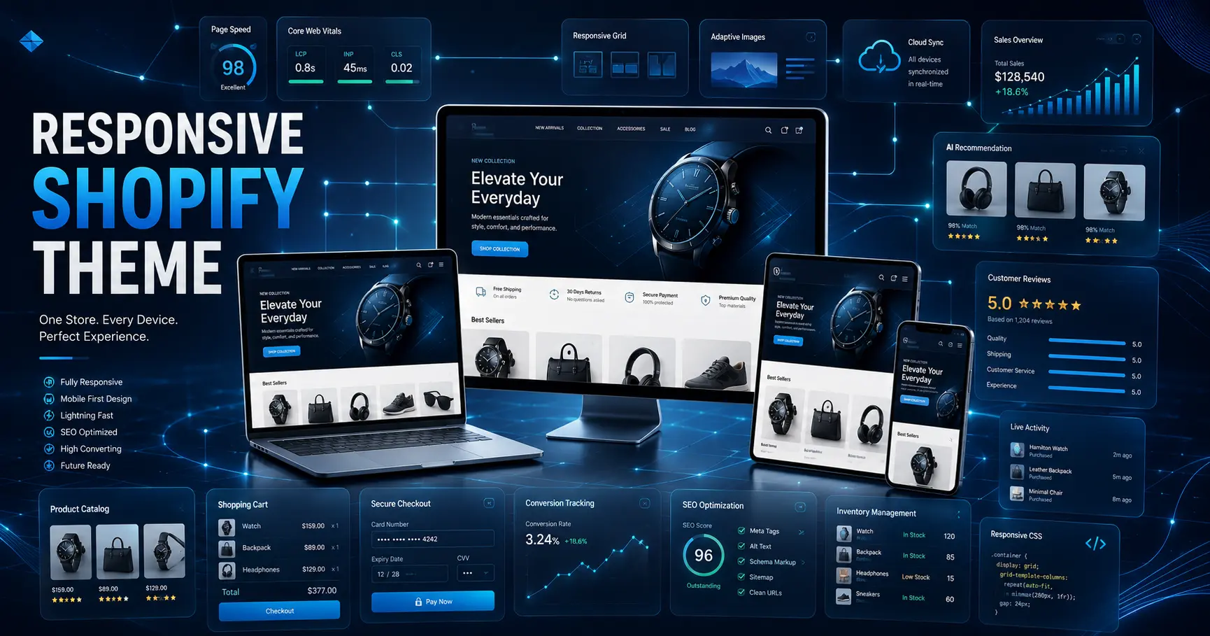
The Ultimate Guide to a Responsive Shopify Theme
Learn everything about choosing a responsive Shopify theme. Boost mobile sales, improve SEO, and deliver flawless user experiences. Get expert help today!
The Ultimate Guide to a Responsive Shopify Theme
A responsive Shopify theme ensures your online store looks and functions perfectly on every device your customers use. From smartphones to desktops, responsive design adapts seamlessly to deliver a consistent shopping experience that drives conversions.
Quick Answer: A responsive Shopify theme automatically adjusts your store's layout, images, and navigation to fit any screen size. This improves user experience, boosts mobile sales, enhances SEO rankings, and eliminates the need to maintain separate mobile and desktop versions of your site.
Let's explore everything you need to know about choosing, implementing, and maximizing a responsive Shopify theme for your e-commerce success.
What Exactly Is a Responsive Shopify Theme?
A responsive Shopify theme is a design template built with flexible grids, scalable images, and intelligent CSS that allows your store to adapt automatically based on the device being used. When a customer visits your store on a smartphone, the theme rearranges content, resizes images, and adjusts navigation to fit that smaller screen. The same store viewed on a desktop displays a full-featured layout optimized for larger screens.
The key difference from older approaches? You maintain one website, one set of content, and one backend system. The theme handles all the visual adaptation automatically. No separate mobile site to manage, no duplicate content issues, no syncing problems.
Think of it like water filling a container — the content (water) takes the shape of whatever device (container) it's viewed on, maintaining its essence while adapting its form.
Why Is a Responsive Shopify Theme Essential for Your Store?
If you're still questioning whether responsive design matters, consider this: mobile commerce now accounts for approximately 73% of total e-commerce sales worldwide. That's not a trend — that's the reality of how people shop today.
Here's why a responsive Shopify theme isn't optional anymore:
Improved user experience across all devices. Customers expect your store to work perfectly whether they're browsing on their morning commute or shopping from their laptop at home. A responsive theme delivers that consistency without you lifting a finger.
Higher conversion rates on mobile. When customers can easily navigate, view products, and complete purchases on their phones, they actually buy. Friction leads to abandoned carts; smooth experiences lead to sales.
Better SEO performance. Google uses mobile-first indexing, meaning it primarily evaluates the mobile version of your site for ranking purposes. A responsive Shopify theme that performs well on mobile directly supports your search visibility.
Cost and time efficiency. Maintaining separate desktop and mobile sites doubles your workload. One responsive theme means one set of updates, one content management system, and one place to fix issues.
Future-proofing your investment. New devices with different screen sizes arrive constantly. A truly responsive theme adapts to whatever comes next without requiring a redesign.

53% of mobile users abandon sites that take longer than 3 seconds to load. Responsive themes built with performance in mind help you avoid this costly pitfall.
What Key Features Should You Look for in a Responsive Shopify Theme?
Not all responsive themes are created equal. Some merely scale down content, while others are thoughtfully designed to provide optimal experiences at every breakpoint. Here's what separates excellent responsive Shopify themes from mediocre ones:
Flexible grid layouts. The theme should use percentage-based grids that rearrange content intelligently as screen size changes. Products that display in a four-column grid on desktop might become two columns on tablet and single column on mobile — each layout optimized for that screen width.
Scalable images and media. Images should resize proportionally without distortion or excessive cropping. The theme should serve appropriately sized image files to different devices — no point sending a massive desktop image to a mobile phone.
Responsive navigation. Desktop navigation with dropdown menus becomes unwieldy on mobile. Look for themes that convert complex navigation into touch-friendly hamburger menus, accordion-style sections, or swipeable categories on smaller screens.
Touch-friendly interactive elements. Buttons, links, and form fields should be large enough to tap easily with a finger. Hover effects that work with a mouse should have touch equivalents for mobile users.
Optimized load times. Responsive themes should be lightweight and prioritize loading content that appears "above the fold" first. This is critical for mobile users who may have slower connections.
Proper typography scaling. Text should remain readable at every size without requiring users to pinch and zoom. Line lengths, font sizes, and spacing should adjust appropriately.

How Do You Choose the Right Responsive Shopify Theme for Your Brand?
With hundreds of themes available in the Shopify Theme Store and from third-party developers, narrowing down your options requires a strategic approach.
Start with your brand identity. The theme should align with your brand's aesthetic — minimalist for luxury brands, bold and colorful for youth-oriented products, clean and professional for B2B. Don't force your brand into a theme that fights against it.
Evaluate essential functionality. Make a list of must-have features before you start browsing. Do you need product filtering? Quick view functionality? Wishlist capabilities? Size guides? Not every theme includes every feature, so know your non-negotiables upfront.
Check customization options. Some themes offer extensive visual customization through the Shopify theme editor — colors, fonts, spacing, and layouts — while others require code changes for anything beyond basics. If you're not comfortable with code, prioritize themes with robust built-in customization.
Read real customer reviews. The Shopify Theme Store includes reviews from actual merchants. Pay attention to comments about responsiveness specifically — some themes claim to be responsive but have quirks on certain devices.
Test demos on actual devices. Don't just view demos on your desktop and assume they'll work on mobile. Open the demo on your phone, your tablet, and resize your browser window. Click around. Try the checkout flow. Look for awkward layouts or broken elements.
Consider your product catalog size. Some themes are optimized for small catalogs with beautiful full-page product features, while others handle large inventories with filtering and pagination. Match the theme to your catalog reality.
What Are the Steps to Implement a Responsive Shopify Theme?
Once you've chosen your theme, proper implementation ensures you get the results you expect.
Installation. Log into your Shopify admin panel, navigate to Online Store > Themes, and either select a theme from the Shopify Theme Store or upload a theme file you've purchased elsewhere. Click "Add" to install it to your theme library.
Customization. Use the Shopify Theme Editor to adapt the theme to your brand. Upload your logo, set your color palette, choose typography, configure navigation menus, and arrange homepage sections. The live preview feature lets you see changes in real-time.
Content migration. If you're switching from an existing theme, you'll need to ensure your products, collections, pages, and blog posts transfer properly. Most content lives in Shopify's backend and transfers automatically, but theme-specific sections (like homepage layouts) may need manual rebuilding.
Cross-device testing. Before publishing, test thoroughly on multiple devices. Check every page type — homepage, product pages, collection pages, cart, checkout, blog posts, and any custom pages. Verify that images display correctly, navigation works smoothly, and forms are usable on touch screens.
Performance optimization. Use tools like Google PageSpeed Insights and Shopify's built-in theme checker to identify performance issues. Compress images, minimize unnecessary apps, and ensure your theme loads quickly on mobile connections.
Soft launch and monitoring. Consider publishing your theme as "unpublished" first, accessible only via direct link. Have team members or trusted customers test the experience. Monitor for any issues before making it fully live.
Ongoing maintenance. Keep your theme updated when developers release new versions. Updates often include bug fixes, performance improvements, and compatibility with new Shopify features.
Which Responsive Shopify Themes Are Worth Considering?
The Shopify ecosystem offers themes ranging from free options to premium investments. Here are some of the most popular and well-regarded choices:
Dawn (Free) — Shopify's flagship free theme and the new default for new stores. Dawn is highly customizable, supports online store 2.0 features, and provides a clean, modern foundation that works well for most store types.
Brooklyn (Free) — A clean, minimal theme that's deceptively feature-rich. Brooklyn offers customizable homepage sections, a dynamic product grid, and a design that works particularly well for brands with strong visual identities.
Venture (Free) — Built for stores with large inventories, Venture includes multi-column menus, product filtering, and promotional banners. It's ideal if you have hundreds or thousands of products.
Turbo (Premium) — One of the most popular premium themes, Turbo is built for speed and conversion. It offers multiple homepage layouts, quick shop functionality, infinite scrolling, and extensive customization options. The investment pays off for high-volume stores.
Empire (Premium) — Designed specifically for large catalogs, Empire excels at helping customers find products in extensive inventories. It features advanced filtering, promotional tiles, and search capabilities that reduce friction in large stores.
Prestige (Premium) — A luxury-focused theme with cinematic image displays, elegant typography, and sophisticated animations. Prestige is ideal for high-end brands where visual storytelling drives sales.
Symmetry (Premium) — A flexible, modern theme with multiple style variations. Symmetry works well for fashion, lifestyle, and design-focused brands that need visual versatility.
How Do Professionals Approach Responsive Shopify Theme Selection?
Experienced e-commerce agencies and developers follow structured processes to ensure theme selection aligns with business goals rather than just aesthetic preferences.
Discovery and consultation. The process starts with understanding the client's business objectives, target audience, brand identity, and specific functional requirements. A beautiful theme that doesn't support required functionality is useless.
Market research and shortlisting. Professionals research the Shopify Theme Store, review third-party marketplaces, and identify themes that match the initial requirements. This often involves evaluating dozens of themes before creating a shortlist.
Technical evaluation. Each shortlisted theme undergoes technical scrutiny — examining code quality, load performance, SEO structure, accessibility compliance, and documentation quality. Beautiful design means nothing if the underlying code is bloated or poorly structured.
Client presentation and feedback. Shortlisted themes are presented to the client with explanations of strengths, trade-offs, and recommendations. Client feedback refines the selection.
Customization planning. Once a theme is chosen, professionals plan what customizations are needed — visual adjustments, feature additions, or integrations — and estimate the work required.
Implementation and testing. The theme is installed, customized, and rigorously tested across devices and browsers before launch.
Post-launch optimization. The work doesn't stop at launch. Performance monitoring, user behavior analysis, and iterative improvements ensure the theme continues to perform as traffic and catalog size grow.
If this process sounds overwhelming, partnering with professional Shopify development services can ensure you select and implement the right theme without the learning curve.
Frequently Asked Questions
What is a responsive Shopify theme?
A responsive Shopify theme automatically adapts your store's layout, images, and navigation to fit any screen size — from smartphones to desktops — providing an optimal shopping experience on every device.
Are free Shopify themes truly responsive?
Yes, all themes in the official Shopify Theme Store, including free options like Dawn and Brooklyn, are built to be responsive. However, the quality of responsiveness and mobile optimization can vary between themes.
Can I make my existing Shopify theme responsive?
If your current theme wasn't built to be responsive, retrofitting responsiveness is complex and often impractical. It's usually more cost-effective to migrate to a properly built responsive theme.
How do I test if my Shopify theme is truly responsive?
Open your store on multiple devices (phone, tablet, desktop) and navigate through all page types. Alternatively, use your desktop browser's developer tools to simulate different screen sizes and check for layout issues.
Does a responsive theme improve SEO rankings?
Yes. Google uses mobile-first indexing, meaning it primarily evaluates your mobile site for ranking. A responsive theme that performs well on mobile directly supports better search visibility.
How often should I update my Shopify theme?
Update whenever the theme developer releases a new version, especially for security fixes. Before updating, test on a duplicate theme to ensure compatibility with your customizations and installed apps.
Invest in a Responsive Shopify Theme That Drives Results
A responsive Shopify theme isn't just a design choice — it's a business decision that impacts your user experience, search visibility, conversion rates, and ultimately your revenue. With mobile commerce dominating e-commerce, failing to deliver a flawless mobile experience means leaving money on the table.
Choose a theme that aligns with your brand, supports your functional needs, and performs exceptionally across all devices. Implement it properly with thorough testing. Optimize continuously based on performance data and customer feedback.
The right responsive Shopify theme transforms your store from a static catalog into a dynamic sales machine that meets customers wherever they choose to shop.

